Identity
Hope Harbor
About
Objective
Hope Harbor is an organization that prides itself on being a safe haven, welcoming in people in need and offering support to those and actively standing against human trafficking and other injustices.
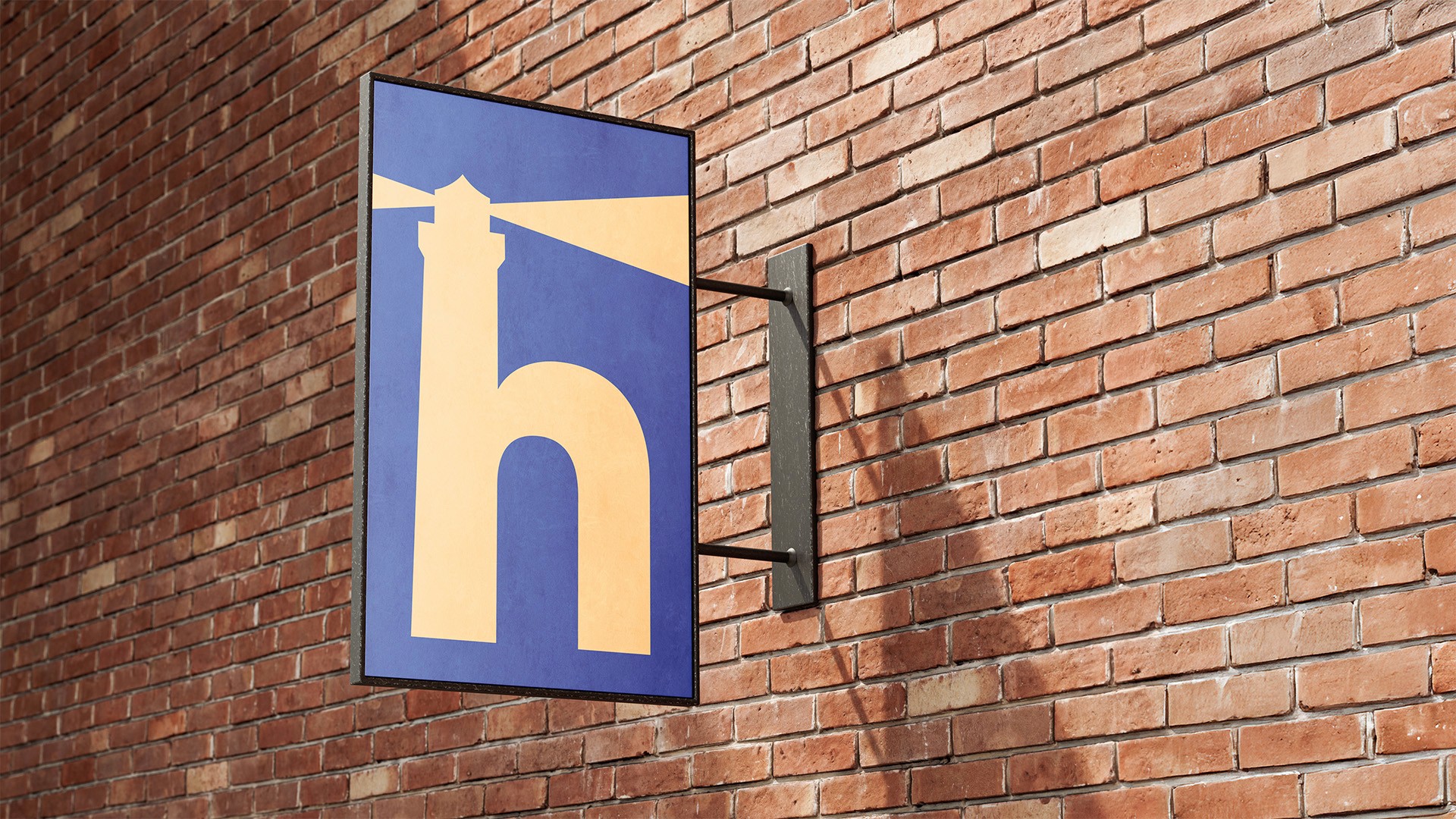
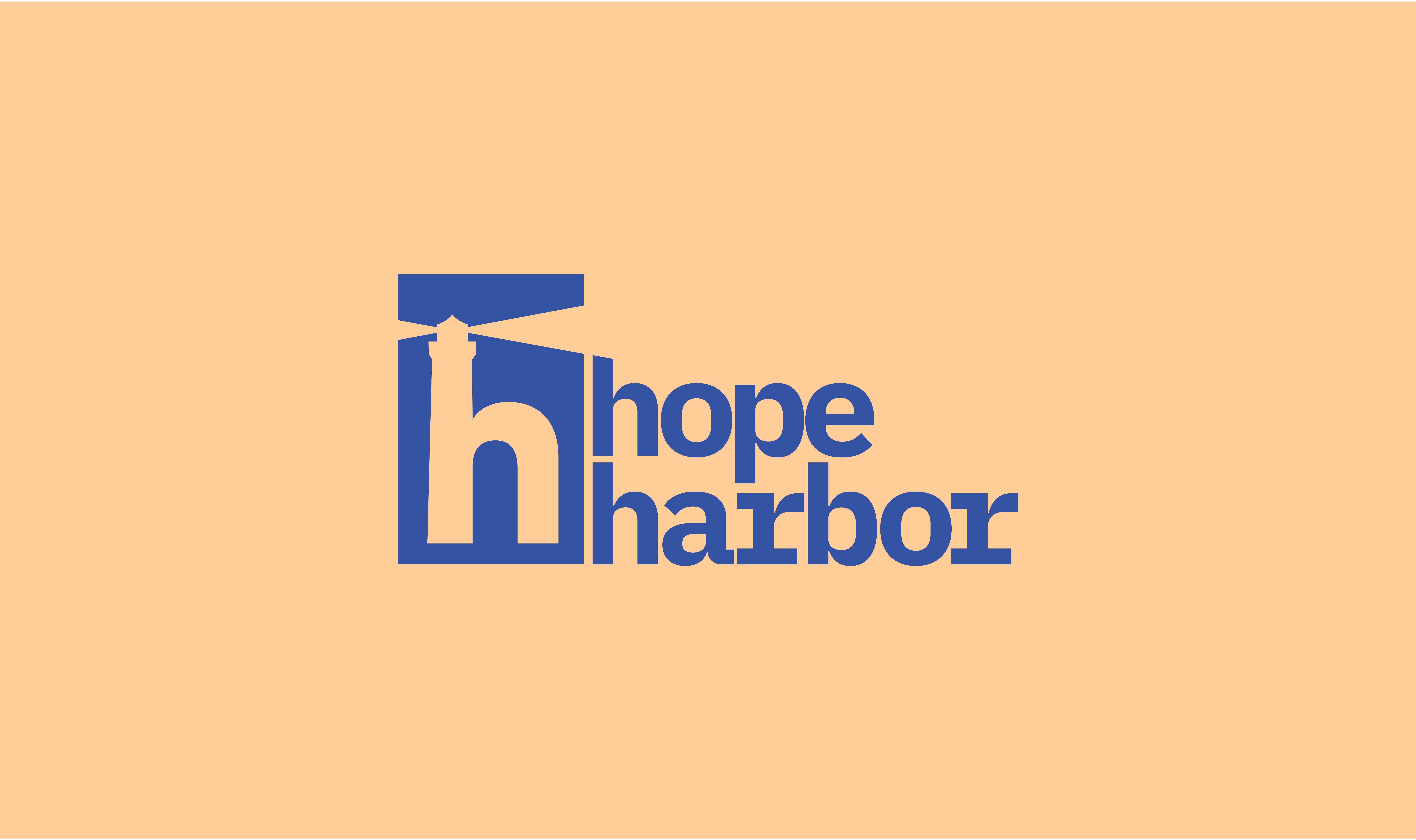
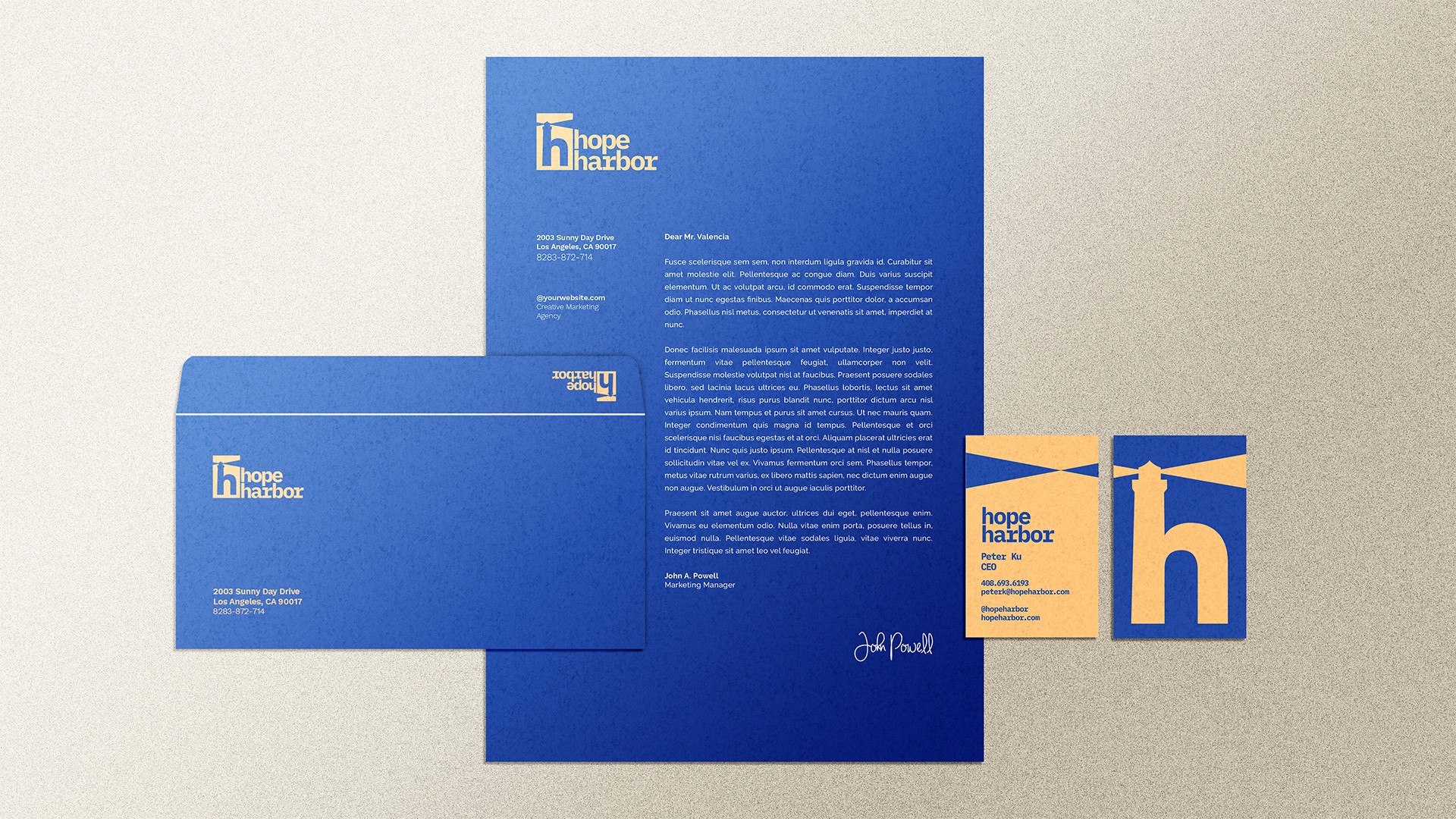
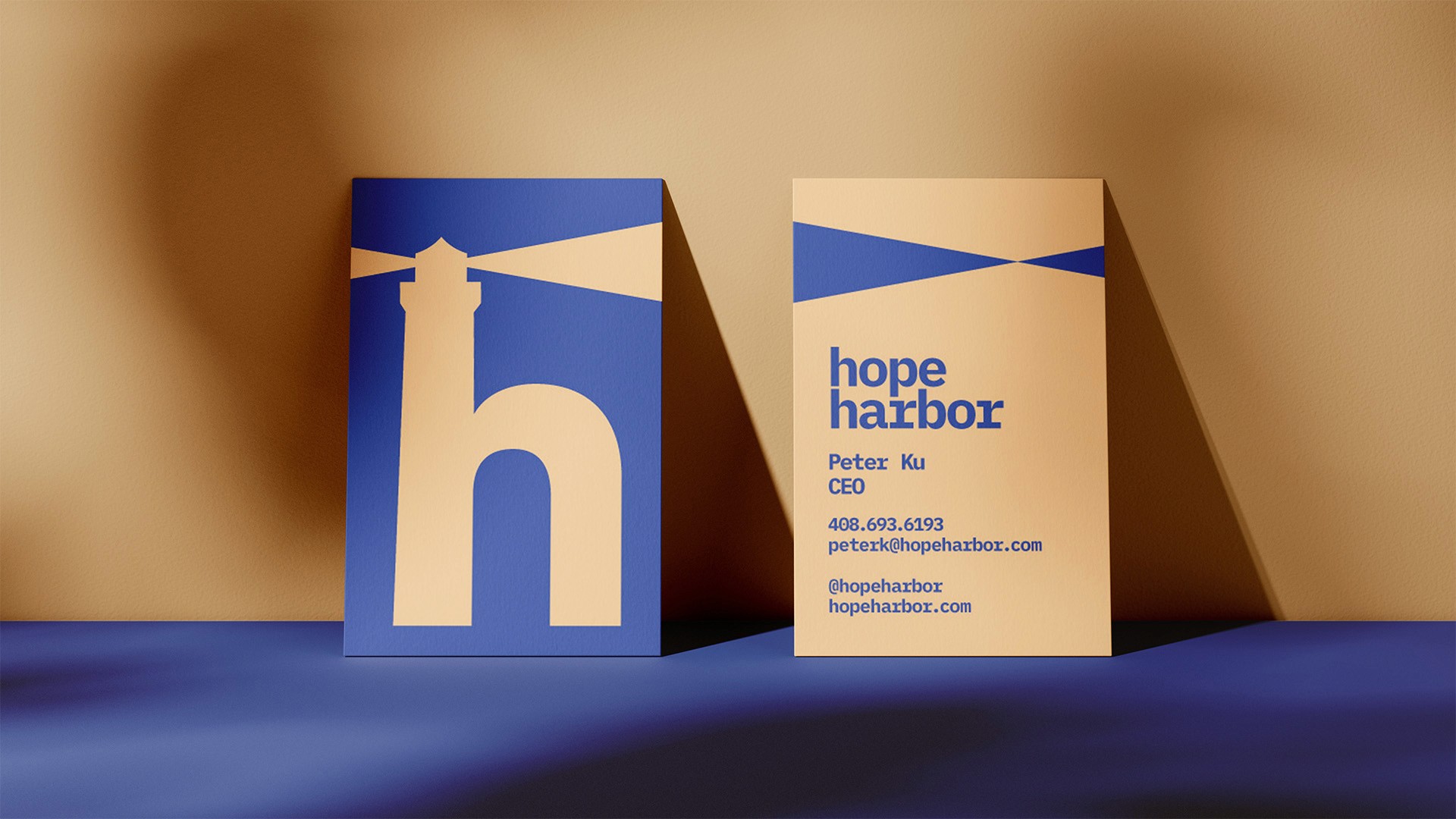
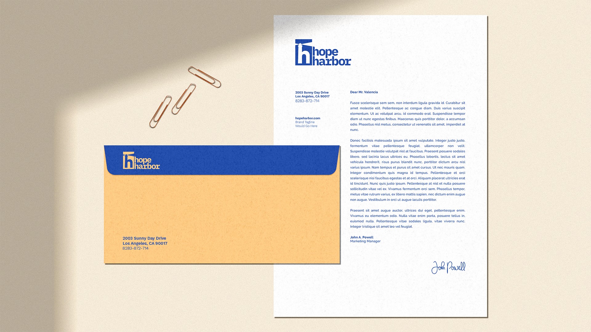
Central to its identity, the lighthouse logo serves both as a symbol and a lettermark, embodying the brand’s purpose as a beacon of light in a dark world. The nautical lighthouse theme reflects the organization’s mission: to provide safety for those close by, and to shine a guiding light that reaches out to the lost and vulnerable. The brand’s color palette—orange/tan and dark blue—communicates strength, safety, and calm, while symbolizing both the sea and the lighthouse’s guiding light.
Project Details
I was tasked with collaborating closely with the client to bring their organization’s vision to life. Through a process of empathetic listening and open communication and collaboration, I worked to understand his goals and needs. I developed design options at each stage, inviting his feedback to ensure the final result aligned with his vision. The client was thrilled with the outcome, and together, we achieved a brand identity that truly represents his organization.
Client
Hope Harbor

More projects
